Responsive Editor
This guide expands upon the knowledge gained in the Basic Tutorial & Save & Load Tutorial, I would recommend you read them first if you haven't done so already.
You should also be familiar with css, media queries & breakpoints.
Overview
In this tutorial, we'll be implementing the basics required to allow users to adapt their designs to different screen sizes. This is a requirement for things like building responsive websites which will be the example for this guide.
The 2 main issues we will tackle are:
- How to allow the user to change the editors screen size.
- How to save node state for various screen sizes
Changing the editor's screen size
The naive approach
First we have to choose at what screen sizes we will work with. We could allow the users to choose the breakpoints. But to keep it simple lets just decide on 3. Based on tailwindcss's breakpoints we'll go with:
const breakpoints = {
    sm: '640px', // small devices i.e phones
    md: '1280px', // medium devices i.e tablets
    lg: '1536px', // large devices i.e computers,laptops...
}
Next we set up some buttons to change breakpoint and a simple use state to keep track of the current breakpoint and we have something like this (ignore the theme provider its for material ui):
function App() {
  const breakpoints = {
    sm: '640px', // small devices i.e phones
    md: '1280px', // medium devices i.e tablets
    lg: '1536px', // large devices i.e computers,laptops...
  };

  const [breakpoint, setBreakpoint] = useState('lg');

  return (
    <ThemeProvider theme={theme}>
      <div className="h-full h-screen">
        <Editor
          resolver={{
            Container,
            Text,
          }}
          enabled={false}
        >
          <div className="flex items-center justify-center h-12">
            <ButtonGroup variant="contained" aria-label="Basic button group">
              <Button onClick={() => setBreakpoint('sm')}>Mobile</Button>
              <Button onClick={() => setBreakpoint('md')}>Tablet</Button>
              <Button onClick={() => setBreakpoint('lg')}>Desktop</Button>
            </ButtonGroup>
          </div>

            <Frame>
              <Element canvas is={Container}>
                    <div className="sm:text-red md:text-white 2xl:text-black">
                      This text is red on mobile, white on tablets & black on
                      desktops
                    </div>
              </Element>
            </Frame>
        </Editor>
      </div>
    </ThemeProvider>
  );
}
On the browser this looks like this:
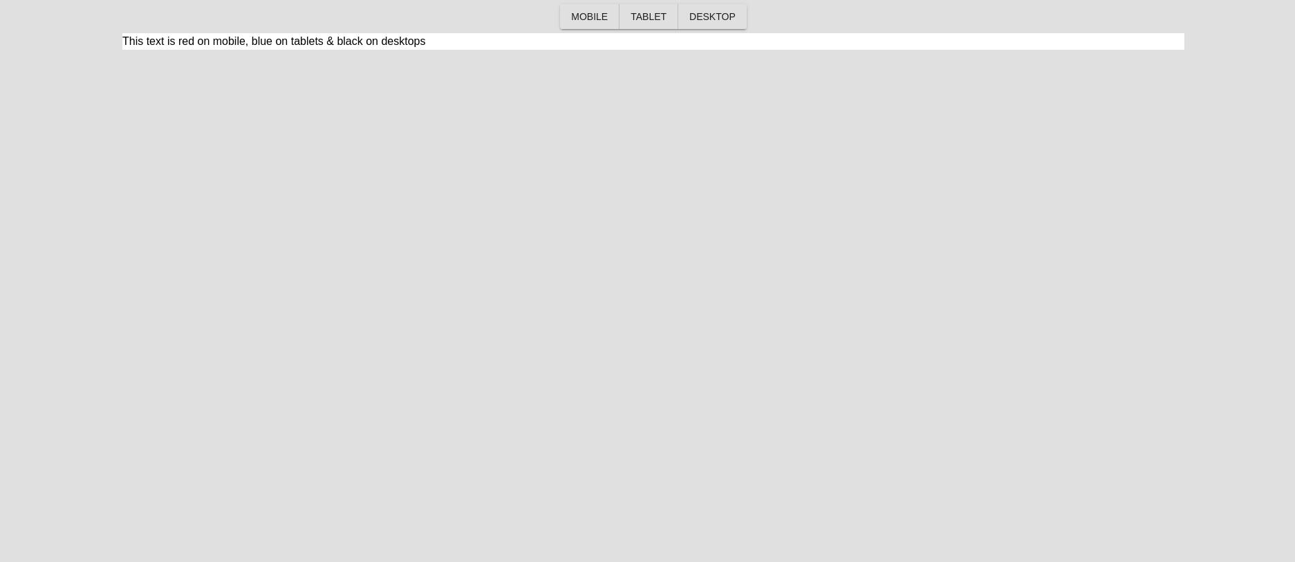
Okay, so we are not winning any design awards, but they don't pay me enough for that (or at all). To change the width of the frame container, one approach would be to wrap it in a div and change the width of that div:
          <div
            className=""
            style={{ width: breakpoints[breakpoint], margin: '0 auto' }}
          >
            <Frame>
              <Element canvas is={Container}>
                    <div className="sm:text-red md:text-white 2xl:text-black">
                      This text is red on mobile, white on tablets & black on
                      desktops
                    </div>
              </Element>
            </Frame>
          </div>
This actually works, well, sort of:
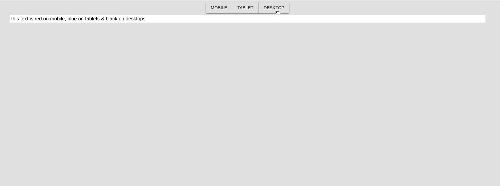
As you can see, we have a problem. The change is not changing color!! If you think about it, it makes sense, we are not changing the size of the screen, only of the component so our media queries will not trigger.
At this point we have two options:
- Have each component keep a state of the classes it should apply based on each breakpoint and pass around the current breakpoint via something like a store or a context. I would not recommend this personally.
- Use an iframe which is how all the big website design apps do it
Using an Iframe
Before you try to replace our div with an iframe and call it a day, I tried, it doesn't work :( We need an iframe-like thing that works well with react. There are probably other options, I encounrage you to do your own research but one I have used and works is the react-frame-component package.
# lets install it
yarn add react-frame-component
Then we can wrap our first frame from craftjs with the frame from react-frame-component and get something like this:
          <div
            className=""
            style={{ width: breakpoints[breakpoint], margin: '0 auto' }}
          >
            <IFrame className="block h-full w-full">
              <Frame>
                <Element canvas is={Container}>
                    <div className="sm:text-red md:text-white 2xl:text-black">
                      This text is red on mobile, white on tablets & black on
                      desktops
                    </div>
                </Element>
              </Frame>
            </IFrame>
          </div>
NOTE: if using SSR framework like next You must ensure that this component runs only on the client
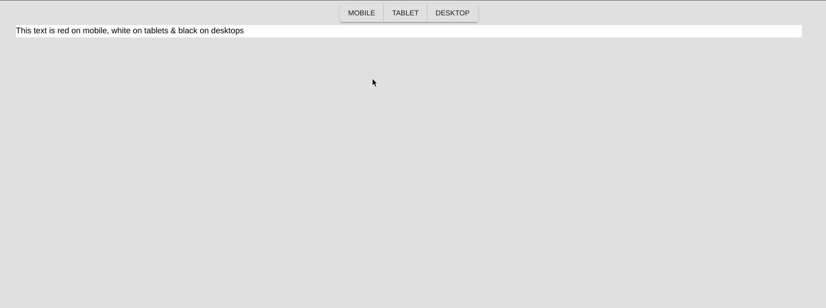
If you did this correctly you should be able you should see the text on the screen and be able to resize the iframe correctly. But, and this is important the text will still not change color. So, we are back where we started, see? progress. This is because of the Iframe CSS Problem
The iframe CSS Problem
An iframe is a website inside your website, therefore it does not have access to your website's style sheets.
This is a very complex issue, fixing it will largely depend on what styling solution you have chosen & how you implement styling in your editor. The general ideal is that you need to add a stylesheet with the styling you need for your editor to function to the iframe.
Here are some solutions based on common patterns
- CSS-in-JS Solution: if using something like
Styled Componentswhere allUser Componentsare styled withstyled-components, in which case - the stylesheet for those components are generated on runtime and is injected into the parent document rather than inside inside the iframe. The easiest solution is to clone the stylesheet into the iframe. - Using tailwind or other CSS library: You can clone the stylesheet into the iframe. Or you can add the tailwind/bootstrap/... cdn stylesheet to the iframe
Either way you will probably have to look around, decide on a solution and implement it.
To clone a stylesheet from your document into the iframe you can just get a reference to the HTML element & append it to the head of the iframe (react-frame-component provides a nice hook that gives you a reference the the iframe document).
Solution
it will copy all the stylesheets from your nextjs app into the iframe and now, finally, it works!!!! But don't go yet, we still have problem #2 to tackle, how to let the user specify responsive styles.
Here is the code up to this point
import { Editor, Frame, Element } from '@craftjs/core';
import { Button, ButtonGroup, createMuiTheme } from '@material-ui/core';
import { ThemeProvider } from '@material-ui/core/styles';
import React, { useState } from 'react';

import { Container, Text } from '../components/selectors';
import IFrame from 'react-frame-component';

const theme = createMuiTheme({
  typography: {
    fontFamily: [
      'acumin-pro',
      'Roboto',
      '"Helvetica Neue"',
      'Arial',
      'sans-serif',
    ].join(','),
  },
});

function App() {
  const breakpoints = {
    sm: '640px', // small devices i.e phones
    md: '1280px', // medium devices i.e tablets
    lg: '1536px', // large devices i.e computers,laptops...
  };

  const [breakpoint, setBreakpoint] = useState('lg');

  return (
    <ThemeProvider theme={theme}>
      <div className="h-full h-screen">
        <Editor
          resolver={{
            Container,
            Text,
          }}
          enabled={false}
        >
          <div className="flex items-center justify-center h-12">
            <ButtonGroup variant="contained" aria-label="Basic button group">
              <Button onClick={() => setBreakpoint('sm')}>Mobile</Button>
              <Button onClick={() => setBreakpoint('md')}>Tablet</Button>
              <Button onClick={() => setBreakpoint('lg')}>Desktop</Button>
            </ButtonGroup>
          </div>

          <div
            className=""
            style={{ width: breakpoints[breakpoint], margin: '0 auto' }}
          >
            <IFrame className="block h-full w-full">
              <AddStyles>
                <Frame>
                  <Element canvas is={Container}>
                    <div className="sm:text-red md:text-white 2xl:text-black">
                      This text is red on mobile, white on tablets & black on
                      desktops
                    </div>
                  </Element>
                </Frame>
              </AddStyles>
            </IFrame>
          </div>
        </Editor>
      </div>
    </ThemeProvider>
  );
}

import type { ReactNode } from 'react';
import { useFrame } from 'react-frame-component';
import { useLayoutEffect } from 'react';
function AddStyles({ children }: { children: ReactNode }) {
  const { document: doc } = useFrame(); // <iframe ref="iframe" /> then this.$refs.iframe....
  useLayoutEffect(() => {
    // this covers development case as well as part of production
    document.head.querySelectorAll('style').forEach((style) => {
      if (style.id === 'colors') return;
      const frameStyles = style.cloneNode(true);
      doc?.head.append(frameStyles);
    });
    if (process && process.env.NODE_ENV === 'production') {
      document.head.querySelectorAll('link[as="style"]').forEach((ele) => {
        if (ele.id === 'colors') return;
        doc?.head.append(ele.cloneNode(true));
      });
      document.head
        .querySelectorAll('link[rel="stylesheet"]')
        .forEach((ele) => {
          if (ele.id === 'colors') return;
          doc?.head.append(ele.cloneNode(true));
        });
    }
  }, [doc]);

  return <>{children}</>;
}
import dynamic from 'next/dynamic';
export default dynamic(() => Promise.resolve(App), { ssr: false });
The problem of styles
TODO